Data Analysis in Excel Sheet
The Data Analysis tool enables you to analyze data in the Autonomous Database by running SQL queries or querying an Analytical View using an intuitive drag-and-drop interface. You can also write custom queries to be run. You now can dynamically apply filters to the result set retrieved using the new faceted search capability on specific columns.
-
On the Excel Sheet, select the menu item Oracle Database.
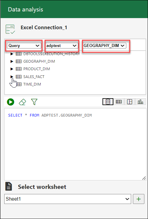
- Select Data Analysis. Selecting Data Analysis opens a Data Analysis panel. On the Data Analysis panel, select Query from the drop-down and the schema you want to use from the drop-down.
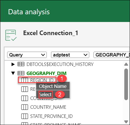
- You can select a column of the table you want to query, right-click the column, and click Select to assist the add-in in forming a select query of the column from the table. Alternatively, you can drag and drop the selected column to the query area that enables the panel to produce a select query of the column in the query display area.
You will view the default query in the query editor area.
- You can select any of the four modes to visualize the results of the SQL query report you generate.
- Base Query: This type of view is by default. The query
written in the SQL editor is the Base Query. This
query will be the base query of the other three
modes.
Note
All the numeric columns are displayed in different colors.The Table browser now has all the columns from the base query.
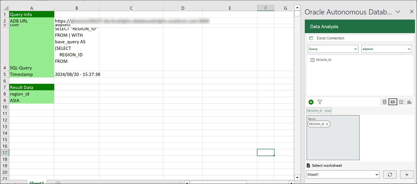
- Table: You can view the SQL results in tabular form. When you select this view, a column drop zone appears for selecting Rows, enabling you to drag and drop columns of the base query. Moving the selected columns in the drop zone allows you to view only those columns in the Result data generated in the worksheet. Select the cross mark beside the Column name to remove it from the drop zone.
- Pivot: You can view the SQL query results in pivot format. By selecting this format, an X and Y drop zone appears where you can drag and drop the selected columns from the Tables browser based on the Base Query to the drop area.
Note
Only numeric values are allowed to be dropped in the values section. - Chart: You can view Area Chart, Bar Chart, Line Chart, or Pie Chart when you select this option. The mappings displayed when you select one of the options are as follows:
- Orientation: Choose between horizontal and vertical orientation types from the drop-down list.
- X axis label and Y axis label: Optionally enter labels for X axis and Y axis.
Note
Only numeric values are allowed to be dropped in the Y axis drop zone.
- Base Query: This type of view is by default. The query
written in the SQL editor is the Base Query. This
query will be the base query of the other three
modes.
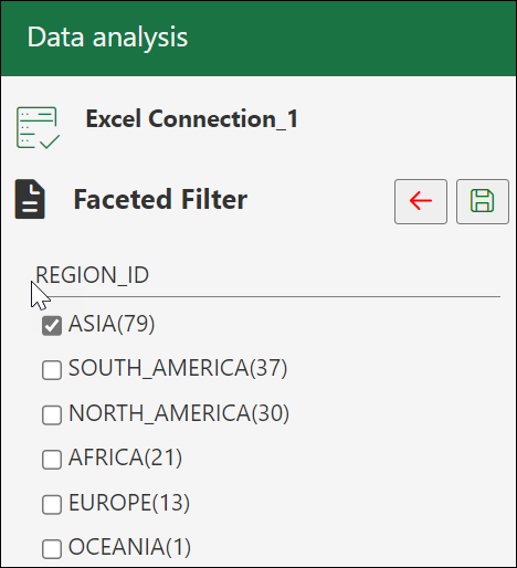
- Click the funnel icon (Faceted Filter) to add filters to the result. The panel generates a filter for each value in the column retrieved from the query result. You can filter different columns on the faceted filter panel and view the results in the worksheet to view only the data you wish. For example, to view the customer reports by Region, click the faceted filter and select Asia under
Region_ID. The number in the brackets displays the count of the items with this property. In the example shown below, there are79records with the region asASIA. - Click Save to view the results. Click Back to go back to the main panel.
-
Select Run to generate the results of the custom query in the worksheet. Click Pause to make any changes to the query, such as updating the columns of the table without updating the worksheet.
Perform aggregate functions using the Excel add-in
SUM, MIN, MAX, AVG, COUNT, and DISTINCT COUNT. In this example, we’re primarily going to focus on using the Data Analysis feature to gain insights from our sales data.
- Select Data Analysis. Selecting Data Analysis opens a Data Analysis panel. On the Data Analysis panel, select Query from the drop-down and the schema you want to use from the drop-down.
Drag and drop the sales value to the query editor and click Table to view the sales in tabular format.
-
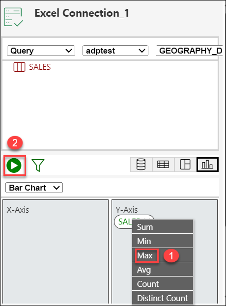
To calculate the sum of the sales value, click the sales value and select Sum from the list of available aggregate functions.
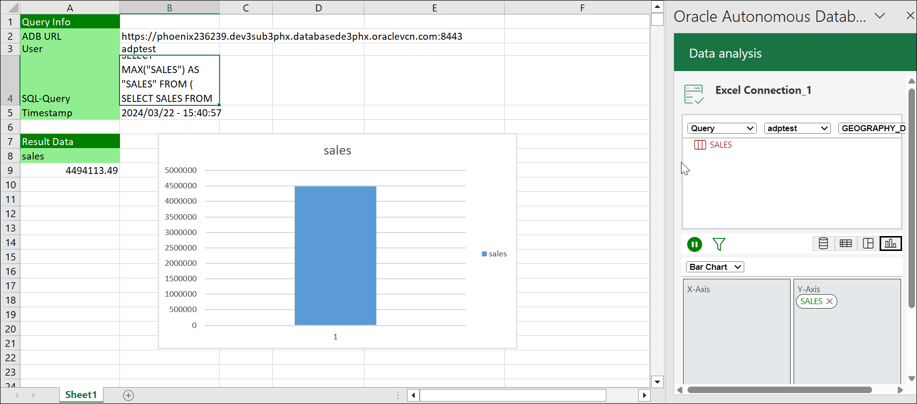
Click Run to generate the sum of sales amount in the tabular format.
You will view the result generated in the excel worksheet.
- Select the ribbon item Oracle Database > Data Analysis on the Excel Sheet. This opens a Data Analysis panel.
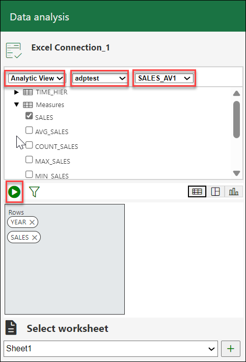
- Select AV from the drop-down, select a schema you can access from the schema drop-down, and the Analytic View from the list of available Analytic Views.
-
You can select any of the three modes to visualize the results of the AV query you generate:
- Table: You can view the AV query results in tabular form. By selecting this view, a column drop zone appears, enabling you to drag and drop selected columns from the Table browser. Moving the selected columns in the drop zone allows you to view only those columns in the Result data generated in the worksheet. Select the cross mark beside the Column name to remove it from the drop zone.
- Pivot: You can view the SQL query results in pivot format. By selecting this format, an X and Y drop zone appears where you can drag and drop the selected columns from the Tables browser to the drop area.
- Chart: You can view the results of the AV query in chart format. By selecting this format, an X and Y drop zone appears where you can drag and drop the chosen hierarchies and measures from the AV browser to the drop area.
Note
You are allowed to drop measures in the Y-axis.
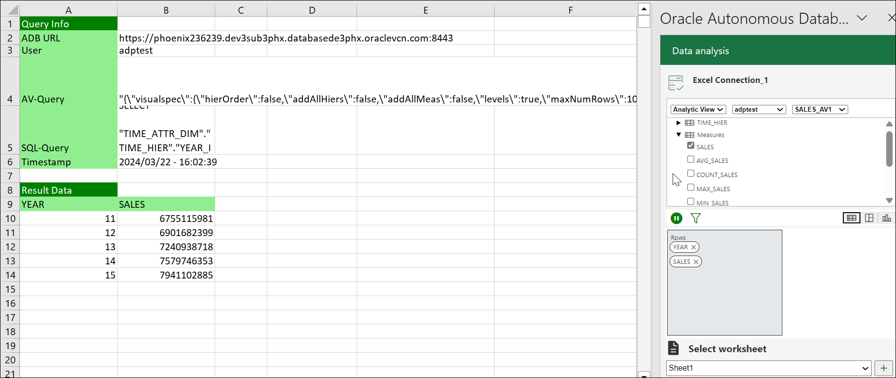
- Click Run to view the results in the worksheet . You can view the total Sales generated along with it’s year of generation.
Parent topic: Oracle Database for Excel
